User Research for Google and MEB
University attendance in Turkey is based on multiple exams. Candidates list their desired schools in order of preference, most to least favored, and they are assigned a school and a department by a central government agency.
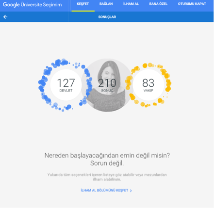
However, students do not get to compare and contrast different universities, branches and departments easily. Google wanted to create a helpful guide on university research, and they wanted to run some tests to see if their design assumptions were working out.
Planning the Research
I was contacted to help Google run a focus group for the prototype they had. I gathered requests from all parties (Google, consulting agency they worked with, and development company they contracted) on what they expected to learn from these tests.
I persuaded them to run a usability test and generative study instead, for two simple reasons:
- They already had a prototype, which made it really easy to see if assumptions worked out OK.
- A focus group in which all participants are teenagers would just be slippery slope to the bandwagon fallacy.
Usability Analysis
I reviewed the prototype made in Invision, making notes of the usability issues to be looked out for. I also started creating scenarios for the test at this stage, and requested additional transitional screens and actions so the participants don’t get stuck following different paths.
Participant Recruitment
I decided to go with 10 participants, 5 of whom were still high school students, and 5 who had taken the exam at least once before and was going for it again.
This division was done so we could see how first-timers and experienced exam takers differed in their approach to school research, and to see if we can help guide uninformed students with those insights.
Testing & Gathering Information
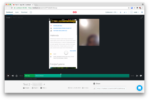
The app was going to be a mobile-only web app, as the assumption was that “students spend all their time on their phones.” So I ran the studies on an iPhone, recording the screen through Lookback. I also recorded additional audio and video through a Mac using an Apogee Mic, both for additional clarity in audio and as a backup.
Study Results
With the results, the app went from being mobile-web-only to a fully fledged responsive web app. The assumption that students used their phones more than computers were true, but the interviews and usage patterns showed that they expected to use larger screen real estate and multiple tabs to research a life-altering decision such as a university selection.
The insights also led to a couple of changes in information relay and interaction behavior, to better accomodate the difference in levels of awareness on what to look for.